Images
Images and photos on your webpages can help increase engagement and build emotional connections with your users. Follow these guidelines for proper use.
Images on the Web
Images should have a purpose. Don't put an image on your page just to have one.
To determine if you should use a photo or image on your webpage, ask yourself these few questions:
- What are the benefits of using this image?
- Does it help people understand the rest of the content on the page?
- Does this image create an emotional appeal?
- What message is the image sending to your users? Is there a message being sent at all?
Alternative Text
Any time you use a meaningful image, photo, graphic or other non-text content, add an alternative text (i.e. alt text, image description).
Alternative text is important. It uses words to communicate what the picture is about. This is helpful for those using assistive technology so they can have a positive user experience.
Alt text also displays if your image breaks. This ensures your site visitors don't miss important information that might have been communicated using an image.
Tips for Writing Alt Text
Alt text should provide the image's message within the context of the page's context.
Determine what message your image communicates. Is that same message provided in your content somewhere? If not, include the image's message in the alt text.
It's helpful to pretend you're describing the image to someone over the phone. There's no need to be overly specific. Provide just enough information for people to visualize the image in their head.
The typical length of an alt text is about 125 characters. It can be longer or shorter if necessary.
Example:
Students with a valid Student Commuter permit can park in lots with green signs, and the letter G identifier. Green G-Lot parking is not available between 4:00 a.m and 6:00 a.m. Overnight parking is only allowed in parking lot G103.
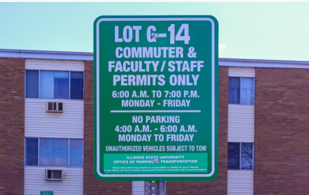
Alt text: A green commuter sign.
Versus
To find parking, look for this sign.

Alt text: Green Commuter Parking sign for Lot G-14, Commuter & Faculty/Staff permits only; 6:00 a.m. to 7:00 p.m. Monday through Friday. No parking 4:00 a.m. - 6 a.m. Monday to Friday. Unauthorized vehicles will be towed.
See also: Accessibility: Images
Photography
University digital products should utilize imagery taken and distributed by University Marketing and Communications. This maintains a high level of quality and branding consistency. Those images can be accessed and downloaded through WebDAM. Photos taken by campus partners can also be utilized if the images are of a high enough resolution and quality.
Stock Photography
The use of stock photography from websites like Unsplash, iStock, etc. should be avoided on University digital products because they weaken the brand and diminish the credibility of the product for the user.
The use of images found through a Google image search, or similar search engine, are strictly prohibited due to the inability to confirm photo copyright information. Images with an open copyright are also prohibited.
Example of Stock Photography
Stock photography is generic photography not specific to Illinois State.

Example of Illinois State Photography
Illinois State-specific photography showcases our people and our campus environments.

Aspect Ratios
An image's aspect ratio describes the relationship of its width compared to its height. (See also: Image Ratio utilities)
Example: A common screen resolution of 1920x1080 pixels becomes 16:9
Landscape
The length of right and left edges of the image are shorter than the top and bottom edges.
- 4:3
- 2:1
- 5:2
- 3:1
Square
The right, left, top and bottom edges are equal in length.
- 1:1
Portrait
The length of the right and left edges of the image are longer than the top and bottom edges.
- 3:4
- 1:2
- 2:5
- 1:3
Charts and Graphs
Charts and graphs combine and display data in simple and easy-to-digest formats, but tend to be visual. These complex images need careful consideration before adding to a web page.
When using an image of a chart or graph on your website, make sure all the data points are referenced in the surrounding text content, in a corresponding data table, or listed in the alt text.
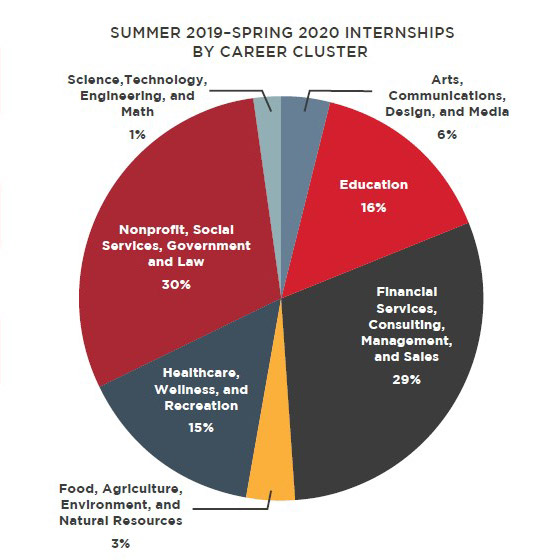
Corresponding data table (See: Data Tables):
| Program(s) | Percentage |
|---|---|
| Science, Technology, Engineering, and Math | 1% |
| Arts, Communication, Design, and Media | 6% |
| Education | 16% |
| Financial Services, Consulting, Management and Sales | 29% |
| Food, Agriculture, Environment, and Natural Resources | 3% |
| Healthcare, Wellness, and Recreation | 15% |
| Nonprofit, Social Services Government and Law | 30% |
Alt text or long description: Summer 2019-Spring 2020 Internships by Career Cluster Chart: Science, Technology, Engineering, and Math 1%; Arts, Communication, Design, and Media 6%; Education 16%; Financial Services, Consulting, Management and Sales 29%; Food, Agriculture, Environment, and Natural Resources 3%; Healthcare, Wellness, and Recreation 15%; Nonprofit, Social Services Government and Law 30%
Adding long alt text or a long description can be confusing if there are many data points. If the chart has lots of data points, consider using the data table with the image.
Combining Text and Images
Text in or positioned over images need careful consideration before use. Some sections of a webpage may allow for HTML text to be placed over an image (example: Hero Space). Other images may have text as part of the image file.
Text Over Images
Positioning HTML text over images allows the text to be more mobile responsive and read by assistive technology.
To determine if the text on an image is HTML, try to select individual words or characters. If you cannot select the words or characters, your text is flattened or part of the image.
See also: Hero Spaces
Text in Images
Images of text are images where the text is part of the image file. Avoid these types of images when possible. Your page's content should not be embedded in an image.
- It could include information that is relative to the story and is oftentimes hard to convey in alt text and image descriptions
- Individual characters are visual-only, cannot to be selected, and will not be read by assistive technologies.
- The visual-only text is not available to search engines
- Thumbnails are auto-generated and often different aspect ratios. Images of text may get cut off in different ways and provides a less than ideal experience across different devices.
- Images of text tend to be interpreted as an advertisement and may be ignored.
Images of text may be used in certain cases:
- If the image is sized with an aspect ratio that can be resized to clear breakpoints where words are still read clearly and matching alternate text
- Images of banners, photo of a sign, writing on t-shirts, etc. are okay. These do not need to be in the alt text unless they have a specific purpose relevant to the surrounding content.
- Logos with appropriate alternative text
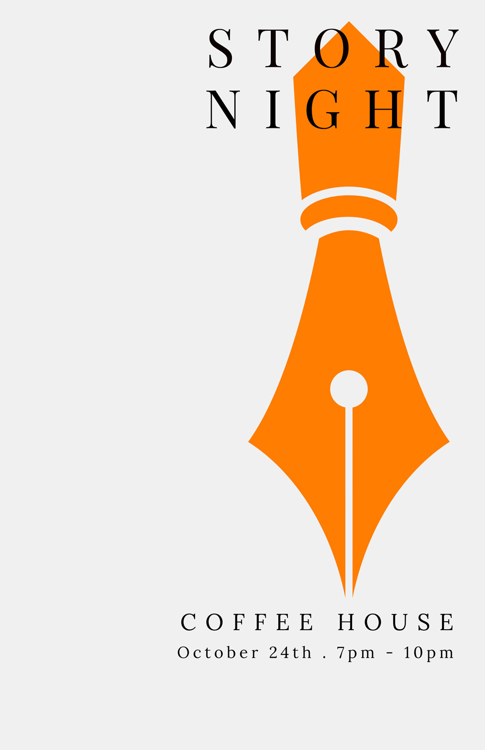
If your image has text, consider how that text relates to the content on the rest of the page. If the text on the image is relevant to the page's content, include it within the alternative text.
Example: Story Night event poster
Clip Art
Clip art is pre-made images that can be found in various word processing programs and the internet. They are often digital illustrations that do not fit the Illinois State brand. Avoid using clip art in web content.
Example:

Emojis
Emojis are small digital images or icons used to express an idea or emotion. They also facilitate communication by breaking down language barriers.
Emojis should be used carefully. People with cognitive disabilities, such as learning or comprehension issues, could benefit from these simple images. Screen readers may not read them or the name of the emoji may not make sense and you can lose its meaning.