-
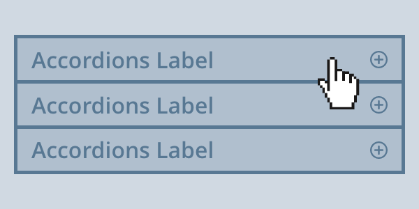
Accordions
Accordions are interactive panels that can be collapsed and expanded to hide or reveal content.
-

Alerts
Alert users to important system feedback and messages.
-

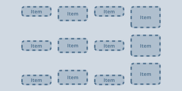
Align Contents
Sets the distribution of space between and around grid/flex items.
-
Align Items
Sets the align-self value on all flex/grid items as a group.
-
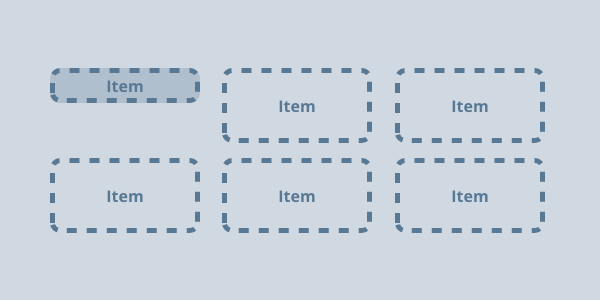
Align Selfs
Overrides a grid or flex item's align-items property.
-
Background Colors
Utilities for setting background colors.
-
Backgrounds
Background colors, patterns, and images.
-
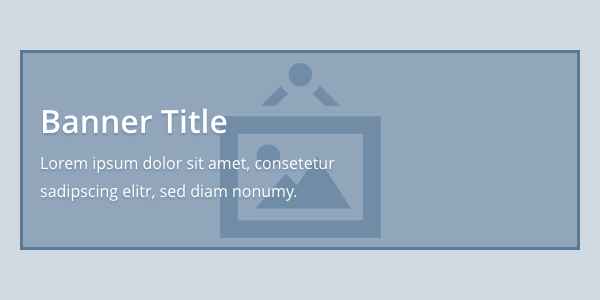
Banners
Content overlaid on an image, often found in the subcontent of OU v3 pages.
-
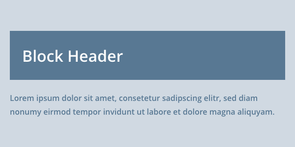
Block Header
A solid color background with a white heading and an optional icon.
-
Border Colors
Utilities for setting border colors.
-
Border Radius
Utilities for setting the border-radius on an element.
-
Border Styles
Utilities for setting the border style property.
-
Border Widths
Utilities for setting border widths.
-

Borders
Utilities for setting full borders.
-

Buttons
Buttons are used to signal actions, submit forms, or trigger new content within the current context.
-

Card Decks
Removes list styling from a set of cards.
-

Cards
A card is a defined surface, separate from the page, on a single topic that is easy to scan for relevant information.
-
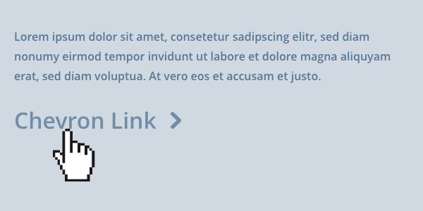
Chevron Links
Bolded links with interactive chevrons.
-
Clears
Utilities for clearing content.
-

Displays
Utilities for setting common display values.
-

Events Feed
Events.IllinoisState.edu-driven event lists.
-
Flex Basis
Utilities for setting the initial main size of a flex item using flex-basis.
-
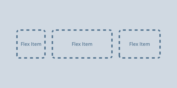
Flex Objects
Creates a flex container and sets default flex value for flex items.
-
Flex Wraps
Utilities for setting the flex-wrap property of a flex container.
-

Floated Images
Floats a piece of media to the left or right of a block of content.
-
Floats
Utilities for floating content.
-
Font Sizes
Utilities for setting the font size for an element.
-
Font Stacks
Utilities for setting the font-family for an element.
-
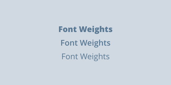
Font Weights
Utilities for setting font weights.
-

Footers
Footer patterns across the IllinoisState.edu domain.
-
Foreground Colors
Utilities for setting the color property on an element.
-
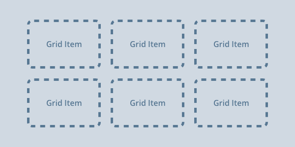
Grids
Autofill grid that creates 1-, 2-, 3-, or 4-column grids depending on the amount of available space.
-
Heights
Utilities for setting an element's height.
-
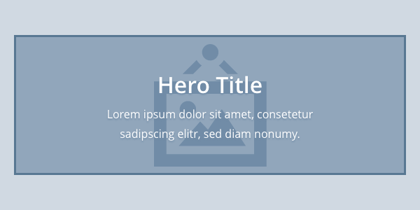
Hero Space
Hero content overlaid on an image or background that appears at the top of a homepage or landing page.
-
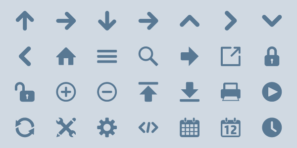
Icon Fonts
This is the official list of icons available in our icon font utility.
-

iframe Embeds
Forces an embedded iframe (e.g. youtube video) to respond to size of its container.
-

iGuides
The iGuide is a script located at the top of each Illinois State webpage.
-
Image Ratios
Utilities for defining a specific aspect ratio for an element.
-
Inline Lists
Removes bullet from list items and sets them to be inline with each other.
-
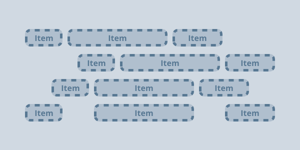
Justify Contents
Tell the browser how to distribute space between and around flex/grid items.
-

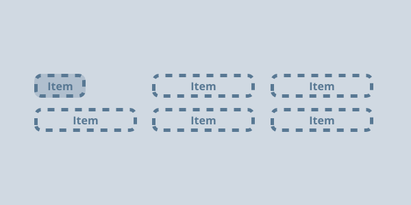
Justify Items
Defines the default justify-self for all flex/grid items.
-
Justify Selfs
Sets the way a flex/grid item is justified inside its container.
-
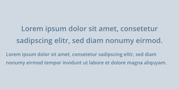
Ledes
Intro text that is slightly larger than body text and uses a light font weight.
-
Max Widths
Utilities for setting an element's maximum width.
-
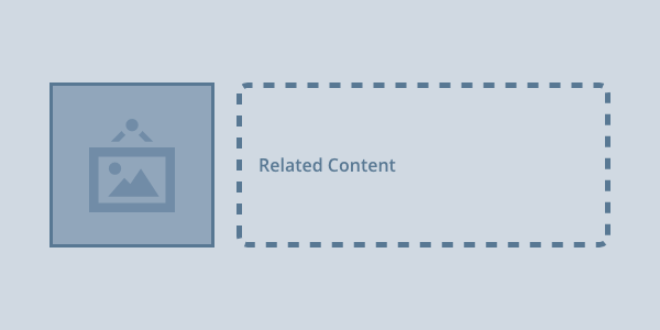
Media Objects
Media objects are a common UI pattern where an image, icon, or other media is placed next to some related content.
-
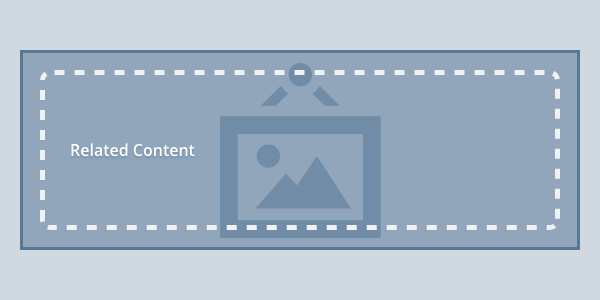
Media Overlays
We use the media overlay object to position text content over an image or other piece of media.
-
Min Widths
Utilities for setting an element's minimum width.
-
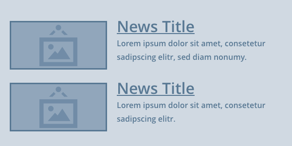
News Feeds
News.IllinoisState.edu-driven news articles.
-
Orders
Utilities for setting the order property of a flex or grid item in its container.
-
Pseudo Icons
Styles icons included via pseudo elements. Use in conjunction with icon classes and space utilities.
-

Quick Links
Stacked list of highlighted links with interactive icons.
-

Responsive Tables
Displays table rows as scrollable columns at small breakpoints.
-
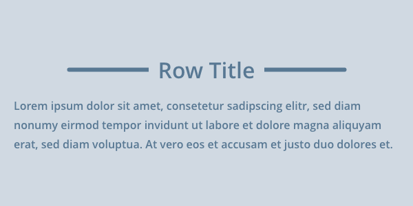
Row Headers
Centered headings with ruled lines on either side.
-
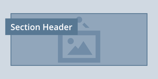
Section Headers
Linked section title text on a solid background overlaid on an image or background pattern at the top of a page.
-
Inset Grid Space
Utilities that define the grid gap between grid items.
-
Inline Space
Utilities that define the space between inline items.
-
Inset Space
Utilities that define the padded space around an item.
-
Stack Space
Utilities that define the space below stacked items.
-
Tables
Styling for data tables.
-
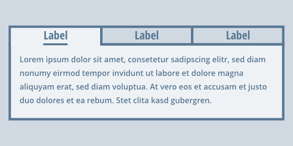
Tabs
Tabs are interactive panels that hide or reveal content when selected.
-
Text Aligns
Utilities for setting horizontal alignment of a block element.
-
Text Decorations
Utilities for setting the text-decoration of an element.
-

Unstyled Lists
Removes bullets and default spacing of list items.
-
Vertical Aligns
Utilities for setting the vertical alignment of an inline or inline-block element.
-

ISU Web Logo
Styling for the University logo.
-
Widths
Utilities for setting an element's width.